.png)


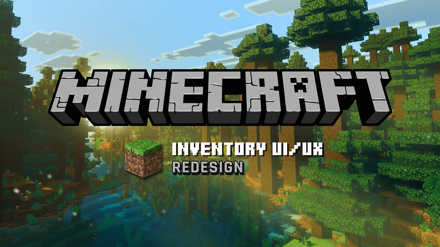
Minecraft Inventory UI/UX Redesign – A Modern Approach
- Barbara Franco

- Mar 26
- 4 min read
Duration: 3 days
This project was created for the March Design Challenge hosted on the HowardLe’s Garden Discord server, the brief was to redesign Minecraft’s inventory UI in a more modern game style without losing what makes it feel like Minecraft.
1. Project Goal
The goal of this project was to make Minecraft’s inventory:
more understandable for newcomers
more efficient for everyday use
more visually polished
while still feeling like Minecraft
2. Identifying the Problem
One thing that shaped this project a lot was the fact that I’m not a long-time Minecraft player. At first, I thought that would make the process harder, but it actually helped me notice one of the biggest friction points very quickly: crafting can be confusing for newcomers.
For players who already know Minecraft well, crafting is often second nature. But for newer or less frequent players, the relationship between the recipe list, the 2×2 grid, the output, and the final crafting action is not always immediately clear. That became the main problem I decided to focus on.
3. Approach
The most important design decision was to keep the iconic 2×2 crafting grid.
There are surely simpler ways to redesign crafting, but those four squares are such a strong part of Minecraft’s identity that removing them would make the redesign feel less authentic. So instead of replacing that system, I chose to make it easier to understand.
My approach was to keep the familiar structure, while improving the flow around it.

4. Main Improvements
The redesign focuses mainly on making crafting clearer and easier to follow.
Key improvements include:
a clearer Recipe List
visible ready / missing states
ingredients shown directly in the grid
a more readable Output area
quantity selection
and an explicit Craft button
Manual crafting: drag items → check result → choose quantity → craft
Recipe-assisted crafting: pick recipe → see ingredients in grid → check result → choose quantity → craft

The redesign keeps both crafting methods instead of replacing one with the other. Players can still craft manually by dragging items into the 2×2 grid, while the recipe list works as a faster guide for understanding what can be made and what ingredients are needed. To support manual crafting, the grid was placed closer to the inventory, reducing drag distance.
Beyond crafting, I also improved:
the separation between Equipment, Backpack, and Crafting
the readability of the Hotbar
the visibility of item descriptions
and small keyboard cues for important actions
5. Process and Iteration
This project moved fast, so the wireframing stage was especially important. I used it to test layout balance, crafting clarity, and the relationship between the inventory, the crafting grid, and the recipe list before moving into the final visual pass.

6. Visual Direction
Visually, I wanted the redesign to feel familiar to Minecraft players, but more polished and presentational.
I kept the overall structure close to the original game, and used a palette that still feels at home in Minecraft’s world. The green accent helps reinforce selected and active states, and also connects naturally with the game’s materials and environments.
The final presentation was also influenced by the atmosphere of the Solar Shaders look, especially through the background image and the overall mood of the composition. That helped give the redesign a more modern presentation layer without changing the core identity of the interface itself.

7. References
The main references for this project were:
Minecraft
Hytale
Everwind
The Legend of Zelda: Echoes of Wisdom
Minecraft was the main foundation, since the redesign still needed to feel true to the original game.
I mainly looked at Hytale and Everwind to study how they approach crafting and recipe readability. From The Legend of Zelda: Echoes of Wisdom, I took inspiration from the way item descriptions are displayed clearly at the bottom of the interface, and from the subtle green glow used inside slots as a decorative visual accent.

8. What I Chose Not to Keep
One idea I explored during the process was increasing the inventory size with an extra row.
In the end, I decided not to keep that direction, because it would start affecting game balance and shift the project away from a UI redesign into a broader game design change. I wanted to keep the redesign focused on clarity and usability, without changing Minecraft’s original logic too much.
9. Final Thoughts
This project became an exercise in balance: making the inventory clearer and more efficient, while keeping it familiar.
As someone who is not a long-time Minecraft player, I think that fresh perspective helped me identify one of the most important friction points in the experience: crafting clarity.
So the final goal stayed simple throughout the process: make Minecraft’s inventory more understandable for newcomers, more efficient for everyday use, and more modern visually without losing what makes it feel like Minecraft.
10. Credits
Created for the HowardLe’s Garden March Design Challenge
Character based on Alex as seen in Super Smash Bros. Ultimate (and modified by me)
Background by Solar Shaders
Inventory icons from this Set
Side equipment icons adapted from the previous set