.png)


A Knight of the Seven Kingdoms Game UI/UX Design
- Barbara Franco

- Apr 22
- 3 min read
Updated: Apr 25

This project started as a UI challenge piece for Beyond the HUD, but after the first version I knew I wanted to push it further and turn it into a proper portfolio case study.
I chose A Knight of the Seven Kingdoms because I loved the tone of the show and wanted to explore how that atmosphere could translate into a game character screen. The main goal was to create something that felt believable for this world while still staying clear and readable as game UI.
1. Project Goal
The goal of this project was to design a character status / equipment screen that:
feels grounded in the world of A Knight of the Seven Kingdoms
presents character information clearly
supports equipment readability at a glance
balances atmosphere with usability
works as a small system, not just a single mockup
From early on, I also wanted the structure to support more than one character, so even though Duncan came first, the screen had to be flexible enough to later expand into Egg’s version too.
2. Final Duncan Screen
Duncan was the foundation for the whole system, so his screen naturally became the place where most of the visual language was defined.
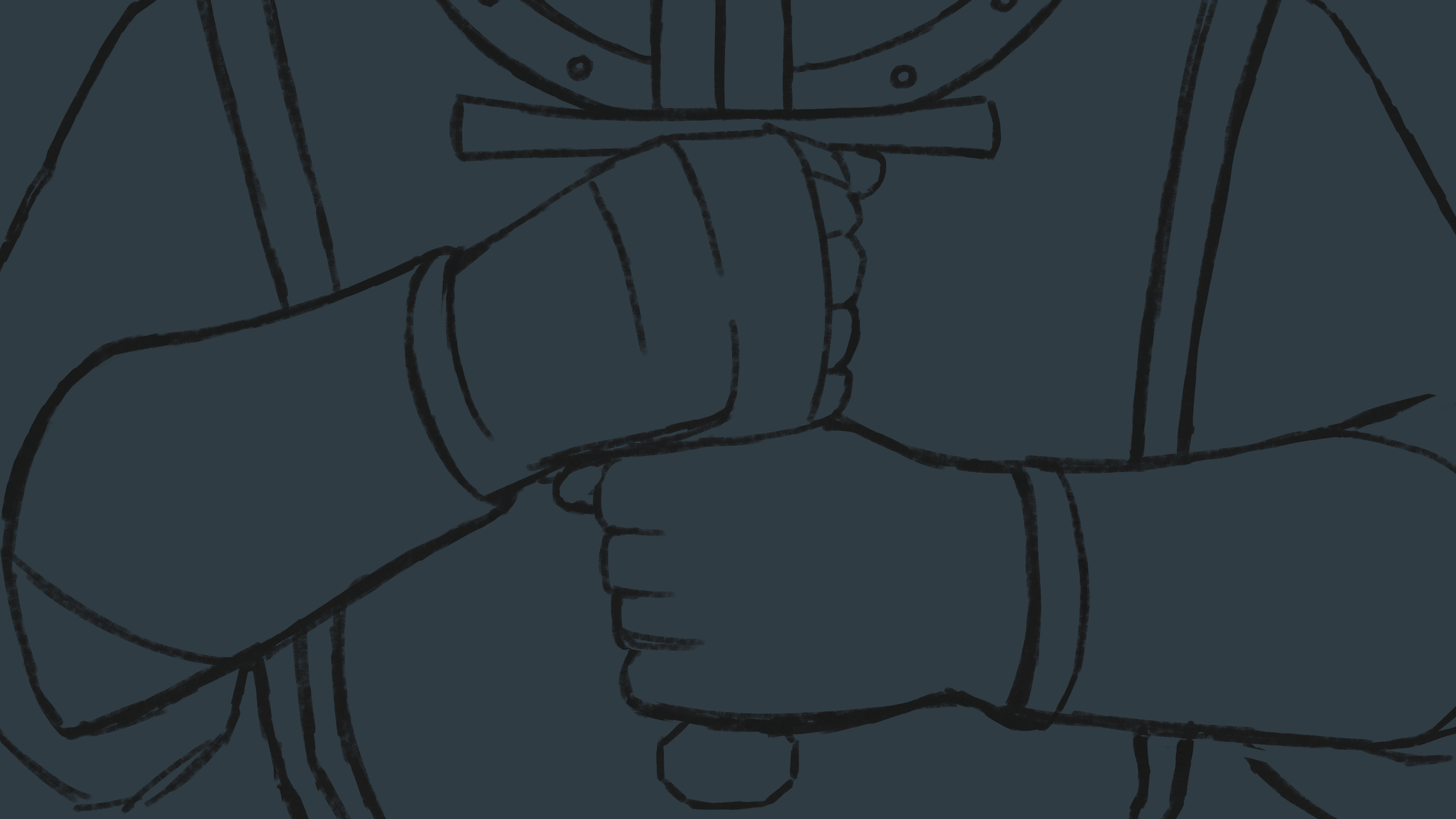
I wanted his version to feel sturdy, recognizable, and a little rough around the edges, just like the character himself. His heraldry, shield, and armor details helped a lot here, because they gave me very specific visual anchors to make the UI feel like part of the serie.

3. Expanding the System with Egg
Once Duncan’s screen felt more stable, I moved on to Egg’s screen. He is quieter, lighter, and much less defined by armor or combat gear, so his screen needed to feel softer while still belonging to the same interface family.
The changes were not just visual. I also adjusted the categories and status language to fit him better.

4. Visual Direction
I wanted the UI to feel tied to Duncan himself, so his gear and heraldry became the main anchors for the interface language. That helped the screen feel more specific and less like a generic medieval menu.
I also tried to avoid an overly polished finish. Rougher surfaces and material contrast helped the UI stay closer to the tone of the show without losing clarity.

5. Process and Iteration
The project started from an earlier wireframe structure that I adapted to fit Duncan and later Egg. The main layout idea was already there from the start:
centered character
equipment slots around the body
status and attributes on the right
top navigation to suggest a larger game system
What evolved later was mostly the visual language, not the structure itself.


6. References
The main references for this project were:
Divinity: Original Sin 2
Baldur’s Gate 3
Assassin’s Creed Valhalla
UXzavr Dark Fantasy Study
I looked at them mainly for layout, grouping, top navigation, parchment treatment, and darker material handling. The idea was not to copy one specific screen, but to study how they balance character presentation with surrounding information.

7. Final Thoughts
This project was mainly about balancing atmosphere and readability.
I wanted the UI to feel like it belonged to the world of the show, while still functioning clearly as a character screen. Revisiting the first version helped me tighten the equipment presentation, improve feedback, and expand the concept into a more complete system with Duncan and Egg.
There are still details I may refine later, but this version already feels much stronger in terms of cohesion, clarity, and character differentiation.
8. Extra
Just a quick GIF showing part of the painting process behind the cover. I usually think its best to use another artist’s work so the full attention stays on the UI, but in this case I couldn’t find the material I wanted, so I ended up painting everything myself.
9. Credits
Ornaments: Studio2am
Textures: Texturelabs
Chainmail brush (asset): 123FreeBrushes
Background: Doosan
Targaryen Shield: Demonic Guard
Targaryen Symbol: Noun Project
Disclaimer: Unofficial fan-made project for portfolio use only. All rights to A Knight of the Seven Kingdoms and its related IP belong to their respective owners.